“We call it Mach because last year we flew our Global 8000 at Mach 1, which is a first in commercial aviation.”
Article content
It started in rural Quebec as a family-owned snowmobile building business almost 100 years ago. Then he added Ski-Doos, Sea-Doos, trains and even commercial airplanes.
On Wednesday, Bombardier unveiled a new corporate logo that it says will reflect the company’s current focus while also nodding to its past. The logo was presented to employees during an event at the company’s headquarters in Dorval.
Advertisement 2
Article content
Article content
“Bombardier has been extensively transformed over the past four years,” said Ève Laurier, vice president of communications, marketing and public affairs, who oversaw the rebranding process. “We thought now is the right time to give a visual vision to what we do, which is commercial aviation.”
The new logo, called Bombardier Mach, depicts four airplane wings overlapping to form a sort of lateral V, making them look like two airplane wings. The shape of an airplane’s nose and fuselage is visible in the white space in the middle of the graphic.
“It features the silhouette of an airplane that breaks the sound barrier, an ode to the ambition and innovative spirit of our people, while the gusts of wind on an airplane reference our heritage,” the company wrote in a statement.
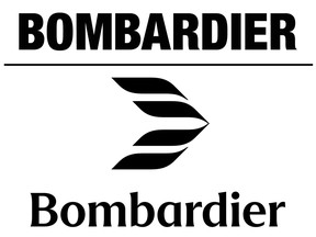
While the company has used symbols in the past, most recently its main logo was simply the name Bombardier, in capital letters.
The new logo is accompanied by a new font for the company name, which will be displayed with a capital B and the rest with lowercase letters, to indicate that Bombardier is the name of the family that founded the company. The curves of the semi-serif letters also emulate the curves of the Mach symbol.
Advertisement 3
Article content
“We call it Mach because last year we flew our Global 8000 at Mach 1, which is a first in commercial aviation,” Laurier said. “Our engineers are really proud to have been able to take a Global to supersonic (speed).”
It wasn’t long ago that Bombardier’s future was unclear. Laden with debt, the company announced plans in February 2020 to sell its railway division to France’s Alstom SA. That same month, it also sold its C Series aircraft to Airbus.
Laurier said the rebrand is a sign that the company’s transformation and the hard work involved have paid off.
“We’ve been through a lot of transformations and the company is doing very well,” Laurier said. “We have been consistently delivering strong financial results and marking it with a new brand shows confidence.
“I think there will be a lot of pride associated with that moment, which tells the world that we are looking to the future. We are happy and proud of the brand. Our products are the best in the world, so the brand must be able to stand alongside the best brands in the world.”
Mark Masluch, senior director of communications, said the logo also reflects the future, as the next generation of Bombardier aircraft will be blended wing aircraft. The more aerodynamic design will enable significant fuel savings as companies look to reduce their emissions and carbon footprint.
Recommended by Editorial
-

Bombardier scores victory with US military after being excluded from Canada’s bid
-

Éric Filion, vice president of Hydro-Québec, will return to Bombardier


Advertisement 4
Article content
Article content